May 23, 2025
How to Add Geo-Targeted Listings to Directories
Learn how to create geo-targeted listings to enhance local search visibility, engage customers, and boost sales effectively.
Menus are the backbone of directory websites, helping users find what they need quickly. A well-designed menu can boost engagement, simplify navigation, and improve user satisfaction. Here's what you need to know:
Quick Tip: Keep menus manageable with 7–9 primary options, group similar items, and regularly analyze user behavior to refine your design.
Key Metrics to Track:
| Metric | Target Range |
|---|---|
| Click Depth | 2–3 clicks max |
| Engagement Time | 30–90 seconds |
| Success Rate | Above 85% |
| Bounce Rate | Below 40% |
A well-organized menu makes it easier for users to find what they need, improving navigation and overall usability.
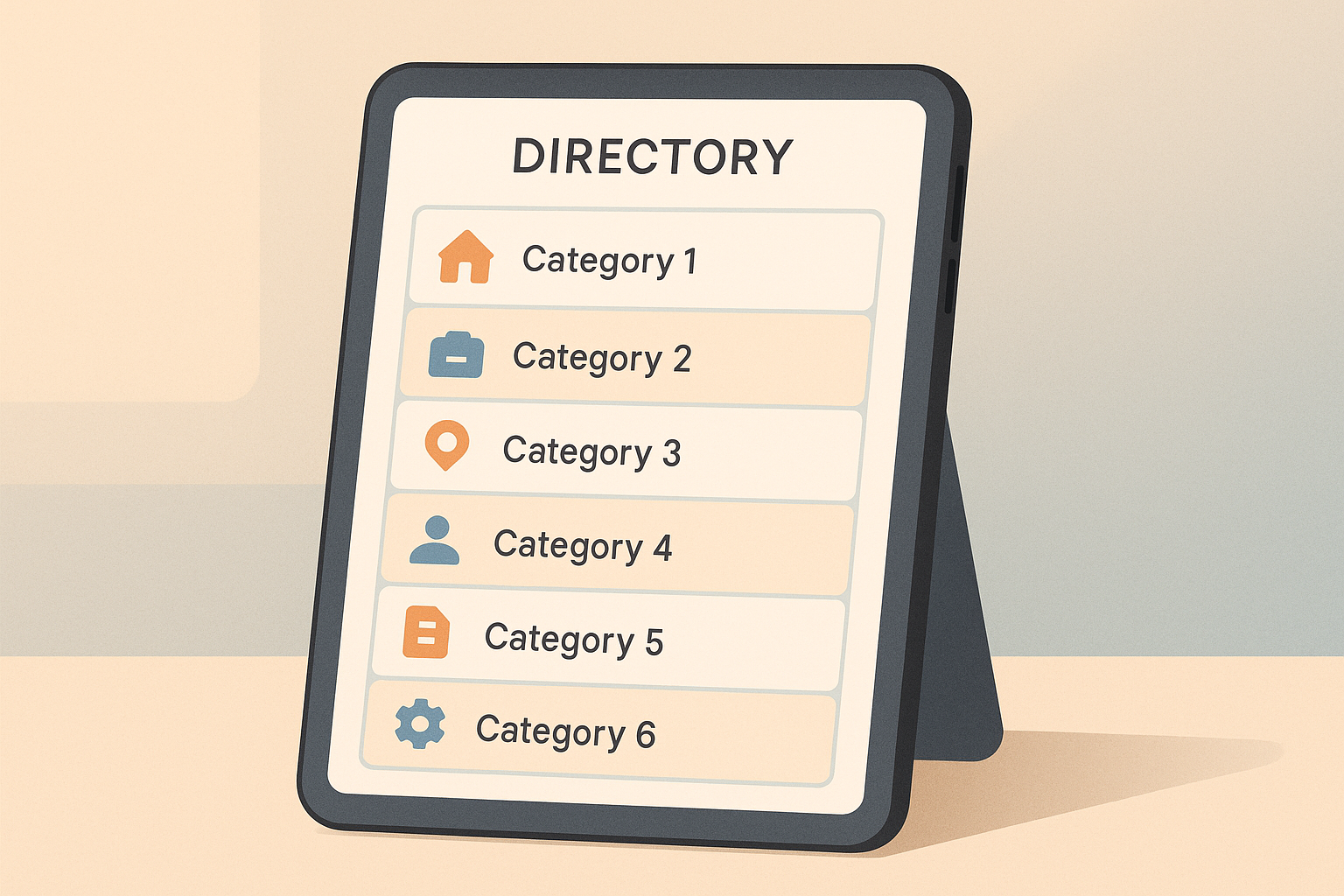
Break your menu into clear levels to keep everything structured. Start with broad topics at the top and get more specific as you go deeper.
| Navigation Level | Purpose | Example Categories |
|---|---|---|
| Primary | Broad topics | Products, Services, Locations |
| Secondary | Subcategories | Product Types, Service Areas |
| Tertiary | Specific items | Individual Products, Local Branches |
After setting up these levels, review user behavior to fine-tune the structure.
Once your menu structure is in place, use visitor data to optimize it further. Focus on:
Analytics tools can show which sections get the most clicks and how users navigate your site. Use this information to adjust your menu so it fits user habits.
Menus work best when they’re not overwhelming. Research suggests users handle 7–9 choices at a time effectively. To keep your menu user-friendly:
If you include custom fields, make sure they improve searchability without making the menu cluttered.
The menu style you choose plays a critical role in how users navigate your directory. Here are some common menu types and their uses:
| Menu Type | Best For | Advantages |
|---|---|---|
| Top Navigation Bar | Small to medium directories | Easy to scan and familiar to users |
| Side Menu | Large directories with many categories | Offers more vertical space and stays visible |
| Mega Menu | Complex directories with subcategories | Helps organize multiple options clearly |
| Hamburger Menu | Mobile-first directories | Saves space with a compact design |
Select a menu type that fits your directory's structure and your audience's browsing habits. For instance, if your directory has numerous subcategories, a mega menu is a great way to keep things organized. With Directify's no-code directory builder platform, you can try different menu styles effortlessly, without needing technical expertise. After selecting your menu type, focus on enhancing it with visuals.
Make your menus more user-friendly by incorporating effective visual design:
Directify's themes allow you to customize these features, ensuring your menus align with your brand while staying clean and functional.
Pair visual design with accessibility features to ensure your menus are usable for all:
Keyboard Navigation
Menus should work with tab keys and arrow controls. Include visible focus indicators so users can easily track their position.
Screen Reader Compatibility
Use ARIA labels and roles in your menu code to support screen readers. For example:
<nav aria-label="Main Navigation">
  <button aria-expanded="false">Menu</button>
</nav>
Responsive Design
Ensure your menus adapt to all screen sizes and meet contrast standards (4.5:1 for standard text, 3:1 for larger text).
A well-designed mobile menu is essential for smooth navigation on smaller screens. To create an effective menu for your directory, keep these tips in mind:
After designing your menu, test it thoroughly on various devices to ensure it works as intended.
Testing is critical to confirm that your mobile menu functions properly across all devices. Focus on these key areas during testing:
Device Compatibility
Check that the menu operates smoothly on different devices and operating systems, such as iOS and Android.
Performance and User Experience
Make sure the menu loads quickly, responds accurately to touch and gestures, and keeps text readable even when zooming.
Tools like Directify simplify the process by offering customizable themes designed for mobile use. With this no-code platform, you can create and test a functional mobile menu without needing advanced technical skills.
Make directory menus more efficient by including search and filtering options, helping users locate listings faster.
For example, ToolHub, a software directory, introduced custom fields in April 2024, allowing users to filter software listings by:
This update boosted user engagement by 40% in just one month.
To improve search functionality:
These features make navigation smoother and more user-friendly.
Additional menu features can further improve the user experience:
Item Count Indicators
Show the number of listings available in each category.
Content Status Markers
Use visual cues to highlight:
User Preference Settings
Let users tailor their menu experience with options like:
These tools can make navigation more intuitive and efficient. However, it’s crucial to ensure these features enhance, rather than complicate, the menu. Regular testing and gathering user feedback will help maintain a balance between functionality and simplicity.
Once you've fine-tuned your design and mobile features, the next step is to evaluate your menu's performance. This helps pinpoint areas for improvement and keeps it user-friendly.
Gathering feedback from users can provide valuable insights into how your menu is working.
User Testing Sessions
To keep feedback flowing, consider:
Monitoring how users interact with your menu highlights what's working and what isn't.
Menu Analytics
Pay attention to these metrics:
| Metric | What to Track | Target Range |
|---|---|---|
| Menu Depth | Clicks needed to reach content | 2-3 clicks max |
| Engagement | Time spent in menu sections | 30-90 seconds |
| Success Rate | Task completion | Above 85% |
| Bounce Rate | Exits from menu categories | Below 40% |
Use these data points to continually adjust your menu for better usability.
To keep your menu performing well, establish a routine update schedule.
Weekly Tasks
Monthly Reviews
Quarterly Updates
Regular updates like these help improve navigation and keep users engaged. By focusing on one menu section at a time, you can manage changes effectively and ensure a better experience for your audience.
To create an effective directory menu, focus on these key principles. Here's a quick checklist to guide your design process:
| Design Aspect | Key Requirements |
|---|---|
| Structure | Organize categories logically with a clear hierarchy |
| Visual Design | Maintain consistent styling and use clear, simple visuals |
| Mobile Design | Ensure the menu is responsive and easy to use on touchscreens |
| Accessibility | Follow accessibility standards like keyboard navigation and WCAG guidelines |
This checklist can serve as a handy reference for improving your menu design over time.
After implementing your menu design, fine-tune it using real-world feedback and data. Here's what to do:
To design a user-friendly and accessible directory menu, focus on simplicity and inclusivity. Use clear, concise labels for menu items and organize them logically to help users quickly find what they need. Ensure your menu is keyboard-navigable and compatible with screen readers by using proper HTML semantics.
Additionally, make sure your menu design meets accessibility standards, such as the Web Content Accessibility Guidelines (WCAG). Features like sufficient color contrast, readable font sizes, and descriptive alt text for icons can enhance usability for everyone. Tools like Directify simplify the process of creating and customizing your directory menu, so you can prioritize accessibility without needing technical expertise.
To ensure your directory menu remains user-friendly and effective, start by gathering feedback from visitors through surveys or usability testing. Analyze how users navigate your site and identify any areas where they might struggle.
You can also use analytics tools to track visitor behavior, such as click patterns and time spent on pages, to identify potential bottlenecks. Regularly test your menu on different devices and screen sizes to ensure it works seamlessly across all platforms. Finally, make iterative improvements based on user feedback and performance data to keep your directory menu intuitive and efficient.
To select the best menu style for your directory, start by analyzing your directory's structure and understanding your users' needs. Consider how listings, categories, and custom pages are organized and ensure the menu makes it easy for visitors to find what they’re looking for.
A user-friendly menu should prioritize simplicity and clarity. Use clear labels, logical groupings, and avoid overwhelming users with too many options. If your directory has multiple levels of content, consider dropdown or expandable menus to keep navigation clean and intuitive.
Remember, the goal is to create a seamless experience that helps users quickly locate the information they need while exploring your directory.
Start creating your professional directory website today with Directify's no-code platform.
Get Started Free